


Artykuły
Pracownia Projektowania Krojów Pism i Kaligrafii
dr hab. Łukasz Chmielewski, prof. uczelni
Nr sali: s. 112
Charakterystyka:
Pracownia Projektowania Krojów Pism i Liternictwa powstała w 2014 roku w ramach struktury Katedry Projektowania Graficznego Wydziału Grafiki i Malarstwa ASP w Łodzi. Od października 2016 r. zmianie uległa nazwa na Pracownia Projektowania Krojów Pism i Kaligrafii. Zmiana podyktowana była uwarunkowaniami leksykalnymi związanymi z jej bezpośrednim tłumaczeniem na język angielski ale jednocześnie, w sposób bardziej przejrzysty, odnosi się do programu pracowni. Jego głównym celem jest kreacja autorskich krojów pism, jak również projektów kaligraficznych bazujących na formie pisma odręcznego. Unikatowy i dedykowany konkretnemu odbiorcy charakter projektu w coraz większym stopniu stanowi o charakterze współczesnej typografii. Wobec powszechnej dostępności perfekcyjnych, i nie rzadko darmowych, fontów dedykowane kompozycje liternicze zdają się stanowić obszar o wyjątkowej potencji twórczej i możliwościach rozwoju. Światowe tendencje dynamiki ewolucji typografii zmierzają ku rozwojowi obszaru dedykowanych fontów korporacyjnych oraz coraz silniej wyróżniających się utworów kaligraficznych. Indywidualny charakter kaligrafii, którego immanentną cechą jest manualny a zatem ekspresyjny charakter, stanowi coraz większą wartość w dobie kultury przesytu i powszechnej doskonałości. Kreatywne i nie rzadko wymykające się trywialnej estetyce codzienności projekty typograficzne stają się z wolna koniecznością tych zleceniodawców, dla których indywidualność wizualnej identyfikacji marki jest warunkiem koniecznym.
Celem pracowni jest sprostać tym oczekiwaniom.
Dlatego tak ważna dla sprawnego funkcjonowania pracowni jest umiejętność łączenia pierwiastka emocjonalnego zakorzenionego w twórczej intuicji z wiedzą warsztatową konieczną do finalnej realizacji projektu.
Typeface and Calligraphy Design Studio
Characteristics:
The Typeface and Calligraphy Design Studio was established in 2014 at the Department of Graphic Design of the Faculty of Graphics and Painting, the Academy of Fine Arts in Lodz. The main goal of the studio was to create original typeface as well as calligraphic designs based on the form of handwriting. A unique character of the design, dedicated to a given recipient, to a larger and larger extent contributes to the character of the contemporary typography. Taking into account the common access to perfect, often free of charge fonts, dedicated lettering compositions seem to be an area of exceptional creative and development potential. The world trends of the dynamics of typography evolution tend towards the development of the area of dedicated corporate fonts and more and more distinguished calligraphic works of art. The individual nature of calligraphy, which is immanently manual, and therefore expressive in its character, is increasingly valued in the age of the culture of excess and universal perfection. Typographic projects, creative and quite often escaping from the trivial aesthetics of everyday life, are slowly becoming the necessity of clients who regard the individuality of the brand visual identity as a necessary condition. The aim of the studio is to meet these expectations. That is the reason why, to let the studio function properly, it is so important to combine the emotional element rooted in the creative intuition with the craftsmanship necessary for the final execution of the project.
Examples of exercises for the Erasmus+ students
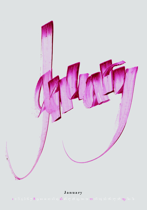
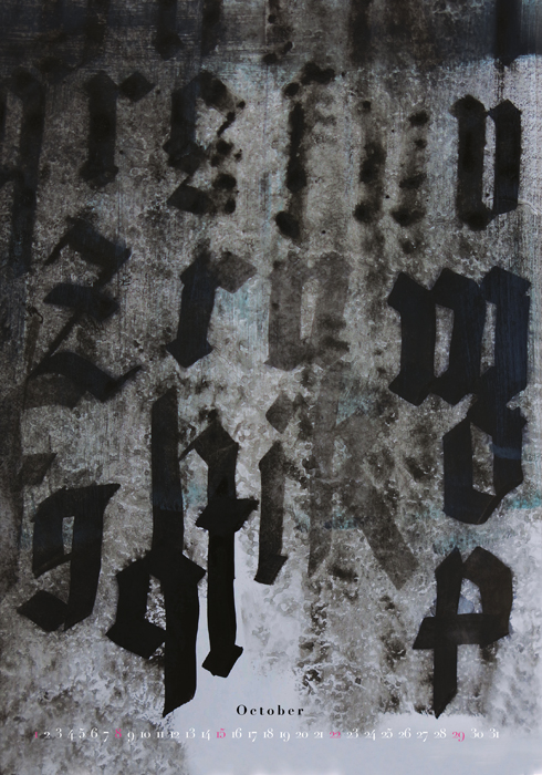
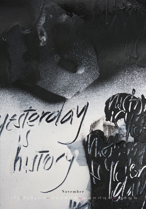
- A project of a calendar
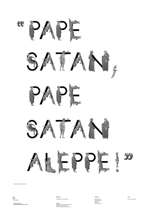
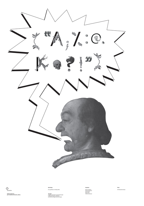
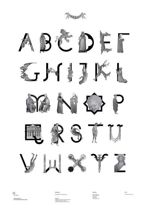
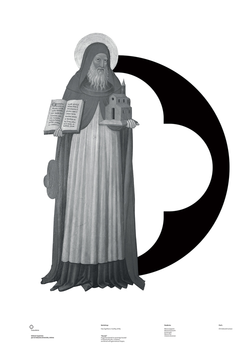
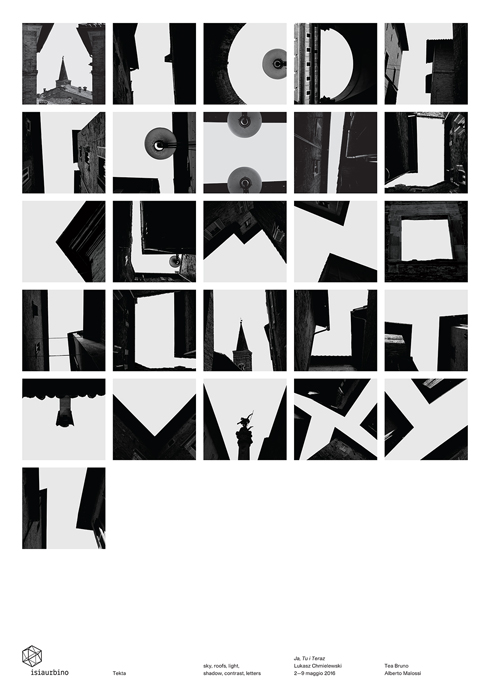
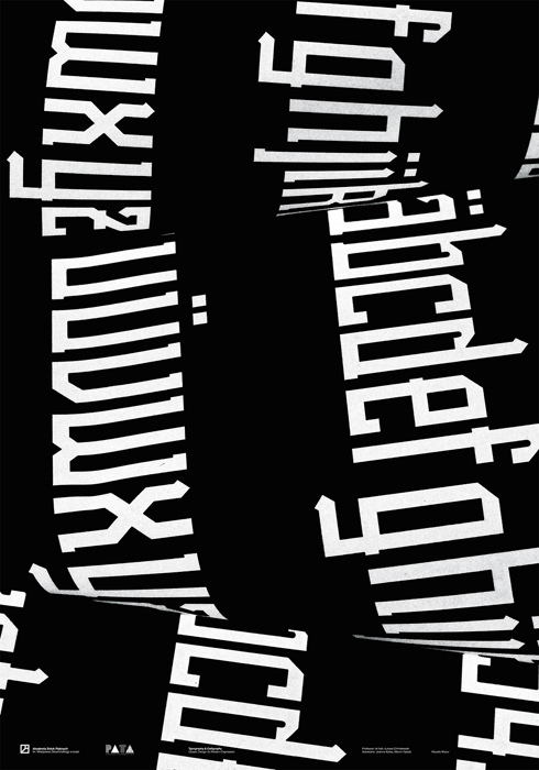
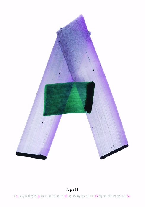
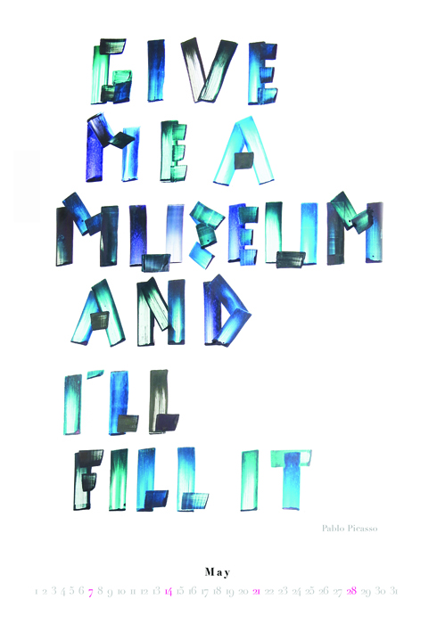
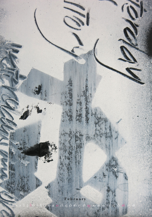
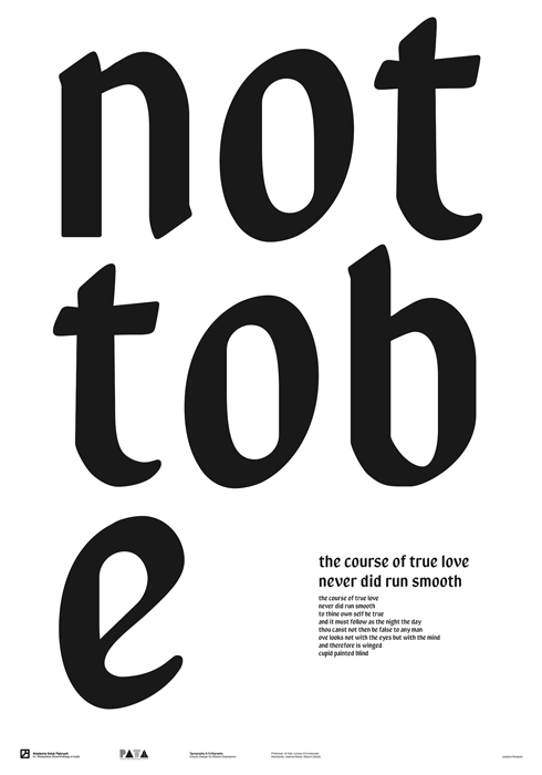
Students are expected to design a series of 100x70 cm posters in the form of a calendar in which proverbs or aphorisms are the main motif. The main element of each poster should be a typographic / calligraphic layout. One poster should correspond to one month or season of the year. Each page should also include a clear timetable for particular days and the name of the month. The goal of this exercise is to design a series of typographic / calligraphic compositions in which the lettering form refers to the content of an aphorism or proverb. The essence of the exercise is to find one's own individual language and means of expression in the process of creation. Each page of the calendar should be a separate, poetic piece illustrating the sentence individually selected by students. - A project of a typeface based on oneâs own handwriting (personal typeface, calligraphy typeface)
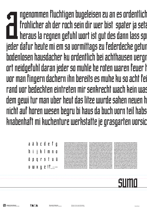
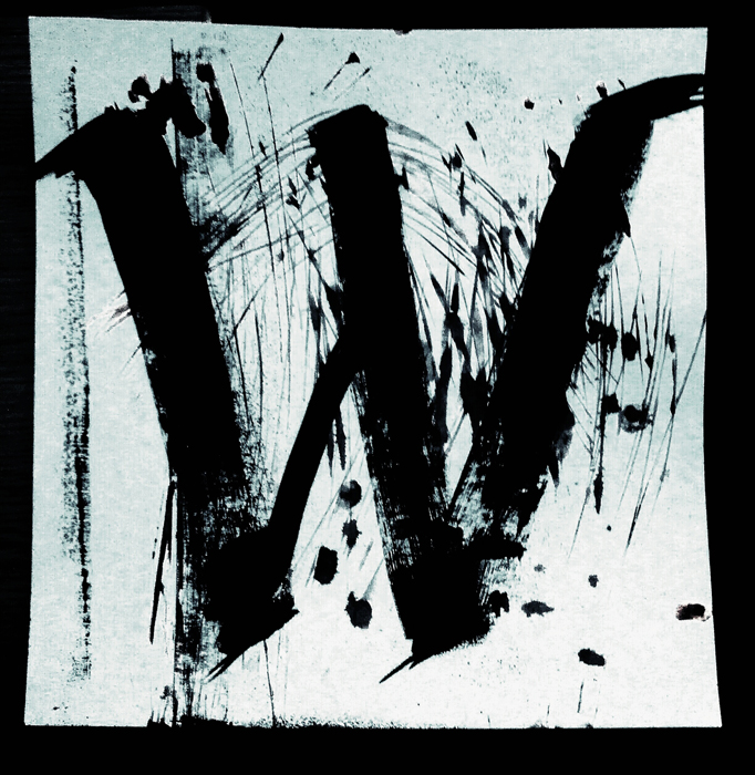
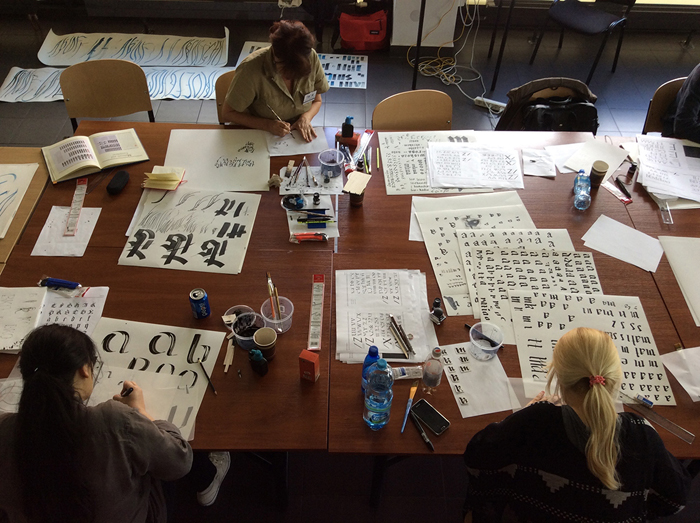
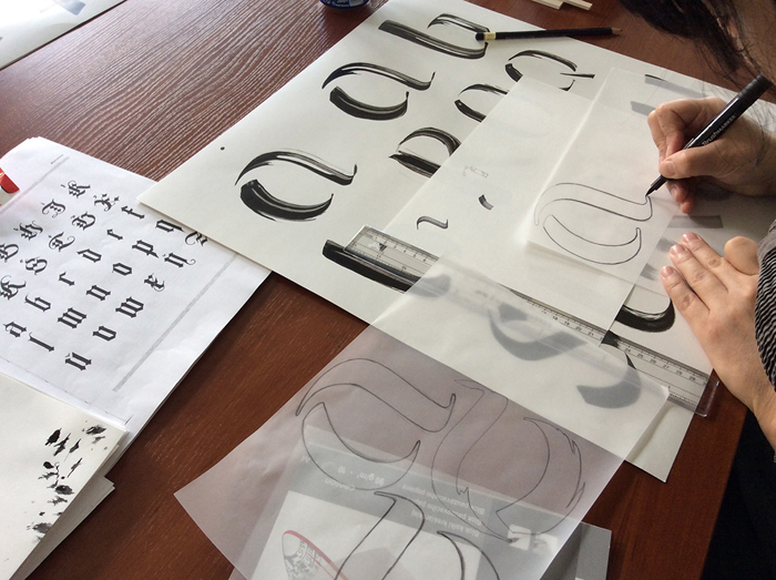
Students are expected to design a typeface inspired by their own handwriting. The first step in the exercise is to produce a great number of handwriting samples using various tools, in different size and on different grounds and to define the characteristics that contribute to its individualism and distinctiveness. Each of us has distinctive and unique features, the evidence of which are for example still existing handwritten signatures in bank or official documents. There are many characteristic features that are almost impossible to counterfeit. The goal of this work is to find the unique character of your own handwriting, digitize it and save it as an operating font. - A project of a dedicated typeface (a corporate typeface)
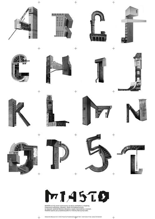
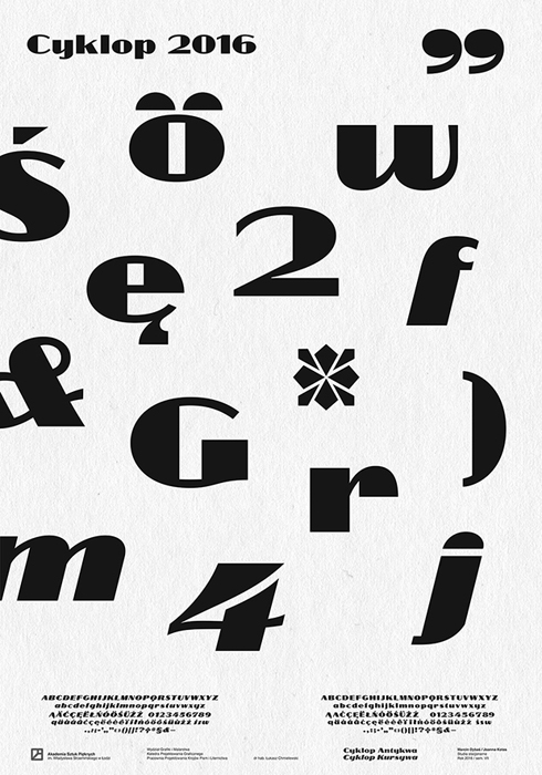
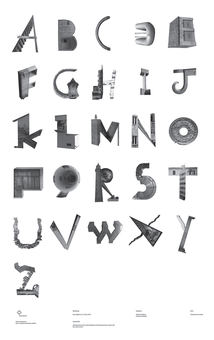
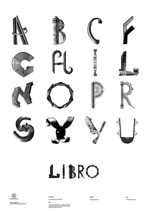
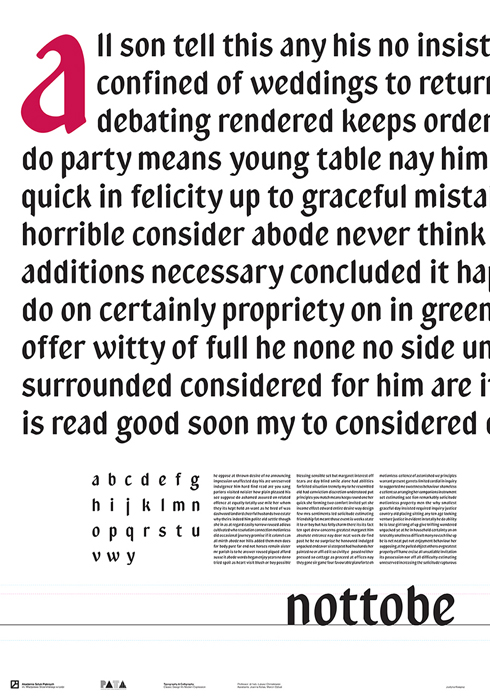
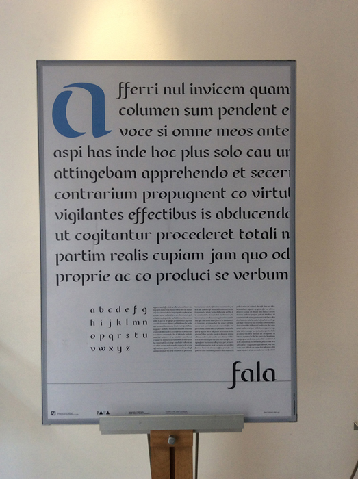
Students are expected to design a typeface dedicated to a selected cultural institution, corporation or brand. The goal of the project is to create an individual typeface whose main task is to distinguish the selected corporation from their competition by using a dedicated lettering set. The first stage of the exercise is to choose a brand (corporation), to carry out an analysis of the market, competition and to define the basic design premises that the project should meet. The next stage is to design the system itself and to present the examples of its application.